Monday, December 28, 2015

Design 3- Assignment 3, 4, and Final

So Design 3's final jump was a blur. I still was having conceptual thinking issues, all I wanted to do was be literal, when I needed to be critical.

I make it seem like less of a push over than it really was, but this final project really killed me. Design 3 has been my weakest attribute to my Design series.

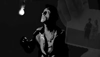
We started off by watching Everything is Illuminated, and in contrary to the trailer, the film was pretty silent. It did have some premium dancing. (haha) *Speak in Alex's accent*

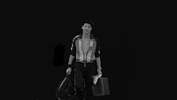
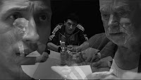
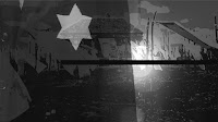
We came up with 8 still shots from the movie, of course manipulated to our concept's ideals.        
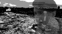


My concept, with the help of good friends in my classes, came to be "Alex picked up the torch his grandfather left behind". This evolved into the idea that the ever-meshing bonds of generations upon generations truly can create a new prospective.

We then started turning all of that into a model. My first model was bland. The wax additive was apparently the best in the class when it came to craft, which is what a lot of us were struggling with. That comment was the only thing that kept me going that last month and a half. My concepts and model space SUCKED, and I wasn't confident at all. So that kept me going that my wax mold surpassed the rest.
The process is always the easiest.    


Once the model was finalized, I could focus on the bulk portion of the final. Which was an Exploding Axo with a human scale, 4 Sections in Negative/White Space, 4 photographs of your model, our semester drawing, and finally the main collage drawing.
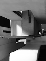
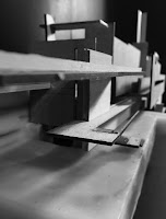


All in all, I think my work came out very great for the mind set I had early on into this project. My conceptual thoughts come slightly easier now, where as now I need to work on crafting simple drawings and models with critical ideals. Wish me luck. 

Thanks for keeping up with me!

-Michelle C. Harter


Sunday, October 4, 2015

Design 3- Assignment 2

So moving on into the next phase of design 3, we're still using the previous project's ideals i.e. the 12 series of pictures and drawings. 12 pictures, 12 drawings, and now 12 models. 

The materials were gonna be using involve that of plexi, white museum board, chipboard, wire, and no if ands or buts... Wax. We are told to chose 3, including wax, as our lowest limit. I've chosen to go with plexi, chipboard, and wax and possibly wire. Tbd. 

Anyway, we made 12 process models. PROCESS. That means ugly. And the uglier the better. It just means you're using additive and subtractive thought freely. 
So this bad boy is pretty ugly if I don't say so myself. 

Either way, the time schedule we have is around two weeks. I'm currently behind on finishing my PROCESS models but that's due to personal reasons. I have jumped ahead and finished three process models completely and finish one model entirely, so 1 out of 12 done, where most people will have a secure 12 process only done. You win some and lose some.

This is my first completed model. I plan to have my professor look at it and I definitely want to discuss color flow of the material with her. I think the wire will add and pull together the industrial look I am going for. 

Thanks for keeping up with me ! 

-Michelle C. Harter

Tuesday, September 22, 2015

Design 3- Project 1

So with all the iterations and process done the past two weeks, I redid my final iteration of the new concepts. 

My concept was "the light will conquer your doubt". Telling a story about my experience through my conformation a couple years back. How I was always around God, but with growing up making my own decisions, I took a break from it, then realizing I needed something to hold onto. 

Here is my final set of pictures and drawings. 

Thanks for keeping up with me! 
-Michelle C. Harter 

Design 3- Assignment 1

So design 3 has taken off this Fall semester and I have the same professor. She's like, Michelle you need to take someone new next semester. And I'm like, yeah I know!! I just love her teaching methods.
I signed up for her in the beginning of this journey because I was told that she's tough, she'll make you cry. And believe it or not I cried this assignment, skipped a class as well. But I signed up for this.

So the project is surrounded by the idea of graffiti. We watched the WWII video on "Kilroy was here". So we needed a graffiti mark in our drawings. I'm getting ahead of myself. 
We needed to take pictures of an artifact that impacted us, in a 12 shot series. Black and white, little-to no background. 
I went through maybe 4 iterations of pictures before I finally got it down. 

I thought, a water bottle is important to me! I run all the time. On the first day of pinning up, i found out it wasn't personal enough. Then I attempted to tell a story about my asthma. 

I thought the sneaker idea would come across more personal. I sent her like 2 other iterations by phone and those weren't clear enough. When this set was pinned up, the background was still too messy and the story was hard to understand. 
So then I decided to skip class, change my concept completely and wing it. Honestly the constant rejection killed my spirits. I needed a day off from this. 

The new iteration I finished at home before redoing it for the final project. 

Thanks for keeping up with me ! 
-Michelle C. Harter 

Thursday, July 30, 2015

Design 2- Project 3

So the day has come where we submit our final. The Bloomingdales armatures took route to their new vertical standings. This model consisted of plexi glass which was later cut, basswood spray painted white, museum board, and wire (optional). 
I utilized score marks solely on the plexi and some Mylar to add definition to the layers. The preparation and occupational spaces began to be visible once the basswood and museum board was added to the armature. 

Here is some process: 


The building time frame consisted of messy planning with cardboard armatures, and expensive plexi later cutting. Until we reached the building week where it all came together quite quickly.


Here is the finished product:


*The drawings were pinned up at Valencia College*

Thanks for keeping up with me!
-Michelle C. Harter

Sunday, July 12, 2015

The Aesthetics

Alright, so I'm veering off alittle but from my progress in class and taking the direction to my progression everywhere. 

Today at work I took on the task of rearranging the nutrition wall. I've been the visual organizer of the nutrition wall and pretty much all the accessories for the past almost 2 years.


The aesthetics matter. They will always matter. 


Not only do I need to make this wall look neat, and clutter free, but also organize it the way the consumer will need it. 
Quick Lesson: Nutrition for running falls along the lines of gels, electrolyte drink replacements, chews, meal bars, and vitamin or powder enhancements. 
Going off of that, the nutrition wall had to express the options and importance the consumers would be utilizing. Organizing the nutrition wall to importance and similarities is a major aspect of aesthetics. 
Not perfect but you need an idea before you can start anything. I decided to set the wall up vertically in relations to the type of nutrition, and horizontally in relations to the brand and organic amount. 

It may sound like I'm telling you about running and the proper nutrition but after taking my design classes, I found this task to be so much easier than before. I knew how to plan and execute a situation based off of consumer ideas and paint a picture/idea to help their selection. 

Here's the final outcome! 


Thanks for keeping up with me! 

-Michelle C. Harter

Wednesday, July 8, 2015

Design 2- Assignment 1

So last Tuesday we took a trip as a class to the Millenia Mall, in Orlando. I was super excited due to the fact it was a mall (I over shop). We measured, scaled, took snapshots, and drew the Bloomingdale's 3 public viewed facades. The main entrance being the first one, the side which was much longer than both other 2 facades due to the ramp, and the third facade which started on the second floor just above the ramp from facade 2. 

Thursday when the drawings were due, I was running late to class and by the time I got there (11 minutes late) the other professor already dismissed U.S. My friend told me the criteria of the homework due Tuesday of the upcoming week so we bought our paper and went on with our weekends. 

When I hear draw the facades on a horizontal paper, I assume draw each facade next to eachother side by side. This became my first iteration...
My professor on Tuesday had us all pin up our work and she observed each one. I received many compliments from other classmates about the detail I put into my drawing. When my professor got to my drawing she asked who printed it out on autocad, I burst out laughing and replied I drew that! I'm guessing that was a compliment, but I haven't worked with autocad yet so who knows. 
Here's more of my first iteration. 

My professor told me to re do my drawings with less detail as well as with the new scale the whole class agreed on. 

This was the new result, pretty plain, but it will help me get to the next step by building my armature with the longest facade for our final project. 

Stay tuned! 

Michelle C. Harter

Thursday, June 25, 2015

Design 2- Project 2

So this next project in Design 2 involved a fruit, and a broad explaination. 

My fruit was the kiwi, originated in China but I emphasized on New Zealand which is kinda the second origin location. We couldn't use color, graphics (obviously), or anything too obvious. Basically the project was impossible at first. 

I went through around 8 iterations of my drawings and paintings for this process. Check em out! 

So this one, according to Steven, looked like a dolphin. I had no idea how to paint... So I just shot into the dark with this one.

This next one I actually attempted some geometric work into the painting. I learned to use my ruler to make straight lines look crisp. 

I then started to add some aspects of the actual vegetation, utilizing the half circle as the section of the kiwi.

I was like let's waste money and try a hybrid! Didn't work. But I was able to use this material for the final product. 


After that, I decided to start all over, a new location, much more zoomed out. I thought the idea of less geometric vegetation would increase the rational ideas of my drawings. 


I took the main landmass, brought it down a notch, and then added random lines to give it an architect appeal! 

I fixed some kinks and my professor was okay with the final product for now. There was more to straighten out. 


My professor suggested to change the orientation and lower the hue of the groves and this was my final product. 

I'm pretty proud of the process. 
I was scored a 4.0 on the final iteration of this project and showcased. 


Thanks for keeping up with me!

Michelle C Harter